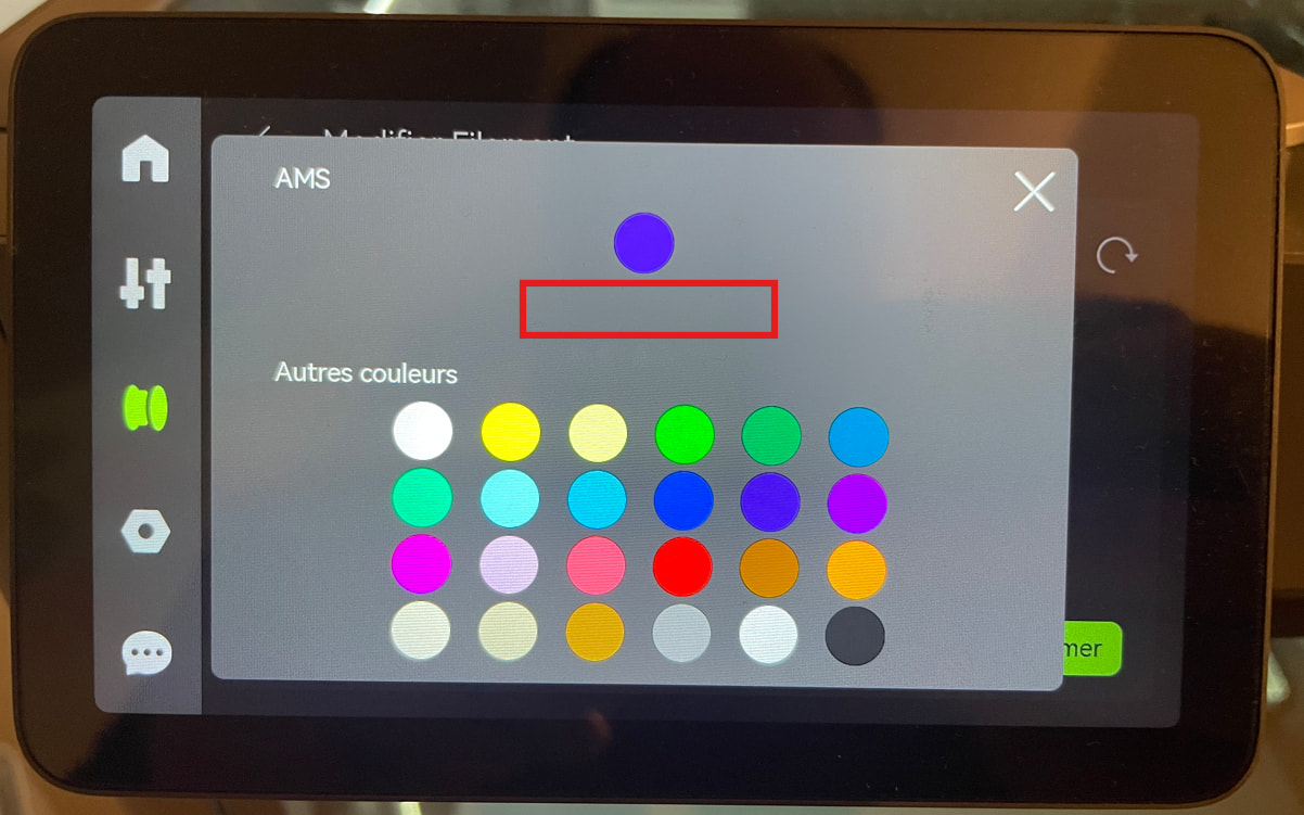
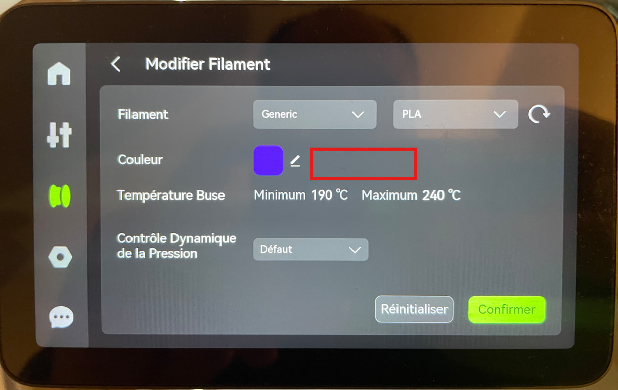
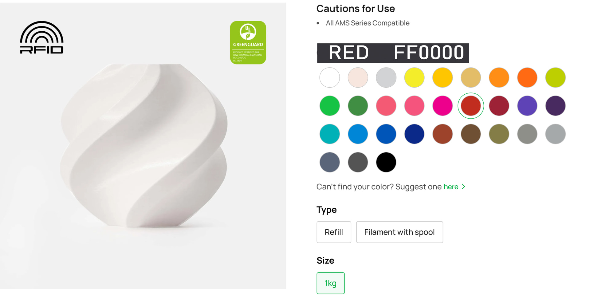
I would like to suggest a small but very important UI/accessibility improvement for the printer’s touch screen (specifically for AMS filament selection).
Currently, when we manually assign a color to a generic filament slot on the printer screen, it only shows a grid of color circles. There are no text labels or names next to or on these colors.
For colorblind users, this makes it very difficult and frustrating to select the correct color.
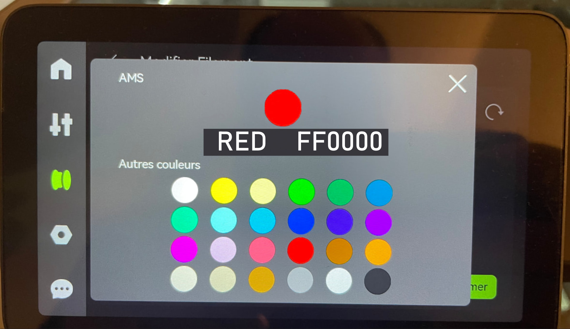
Could you please add the color name text (e.g., “Red”, “Blue”, “Light Grey”) when tapping/hovering on a color, or display the name underneath? This minor update would be a massive quality-of-life improvement for accessibility.
I agree! 1 in 12 men are colorblind while 1 in 200 women are as well. To average that out is roughly 4.5% of the population. (I won’t estimate how many men are the primary buyer of a 3D printer.) Based on stats in 2025 where Bambu sold over 1 million printers, let’s just guess that so far they have sold over 1,500,000 printers (probably more). That means roughly 67,500 of their customers can’t see or pick the correct color on the printer screen!
As an old retired country guy who is also colorblind, please change this Bambu Labs.
@BambuLab this would be an excellent and relatively easy improvement that drastically enhancws accessibility for many customers, not just colorblind but users with any visual impairment, and generally makes life better for all users - I am not colorblind, but for filaments that have many simar colors even I struggle to pick the right one.
Bambu Studio already does this, it would be awesome to have the printers do the same. Thank you!
I’m completely on board with this. By the way, this doesn’t just affect the UI, but also the shopping website.
I recently had a confusing conversation about this, although not in the way someeone might expect. Yes, the colors are labeled, but depending on the language, the naming becomes quite confusing. For example, instead of simply calling it black, it’s labeled as “Charcoal”. Fair enough.
However, when the website is switched to German, the same color is called “Anthrazit”, only for it to appear again as “Charcoal” after the process on the order list. That inconsistency can be confusing, especially for customers trying to make sure they’ve selected the correct option.
It would be great if the colors had clearer and more consistent naming across all languages, whether that’s using the same name everywhere or, even better, displaying the color code alongside the name.
Long story short: the person I was talking to is also color-blind, and because color names are often inconsistent or confusing, he rely almost exclusively on color codes - rather than the names themselves.
That’s another reason why displaying a color code alongside the color name would be very helpful and would make the experience more accessible for everyone.
Although he is almost completely colorblind, he can even edit images in Photoshop thanks to the color codes - just to give you an idea of how powerful this kind of assistance can be. He does commissioned work for clients, and no one has noticed it for decades.
I completely agree with the idea of using color codes. Although I think matching a color code to a color may not necessarily be straightforward for everyone, it’s still a very good suggestion.
However, to avoid a major redesign of the printer’s interface, I think a much simpler first step would be to simply add names to the existing color swatches displayed when assigning a color to a generic filament spool.
This is where my actual problem lies. As someone with color blindness, I have often selected a blue swatch for a purple filament spool, or a grey swatch for a pink one. Not because the colors are particularly similar, but simply because I am unable to distinguish them.
For generic filament spools, I think assigning an approximate color is perfectly sufficient. For example, having a black swatch for a charcoal-colored filament wouldn’t bother me at all.
The goal isn’t necessarily to rethink the entire color management system in the Bambu Lab interface, but simply to start with a small and practical improvement that would already make a real difference for colorblind users. A more comprehensive solution could always be considered later.
Just to be clear: One suggestion isn’t meant to replace the other; they could simply display the color code in addition to the color names. That wouldn’t be a complete overhaul of the system, but just a few more characters.
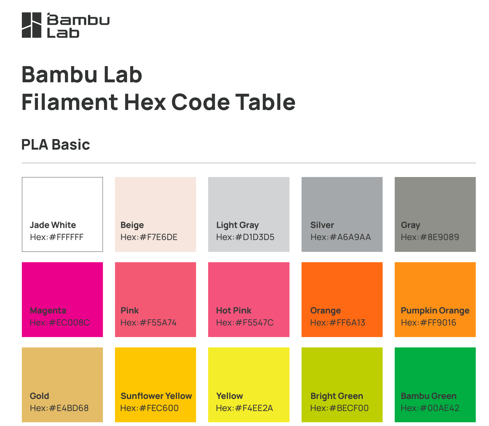
Bambu even already uploaded the codes as a PDF. As I said, I only know this in such detail because a good colorblind friend of mine works with color codes almost exclusively. It also has the advantage of being language-independent.
I completely understand your idea of combining both on the printer’s interface, just as Bambu has done in the PDF, which I also use when recommending the same filament spools.
But going back to your charcoal filament example, how would you envision this working on the printer’s touchscreen when selecting a color?
Surely that’s enough to verify whether the color is correct, regardless of the language, or because someone imagines a different color when they hear ash black, coal black, dark chocolate, charcoal, antracite, carvão, aschegrau, houtskool, węglowy…
Not only would that help people with color blindness - but, as I said, it would also break down language barriers and reduce confusion.
Perhaps the simplest solution would be to display color swatches with both their names and color codes, using a basic color palette without different shade variations.