I want to print a multi color part and I’m very keen on keeping my color changes to a minimum, as well as producing the best looking part possible.
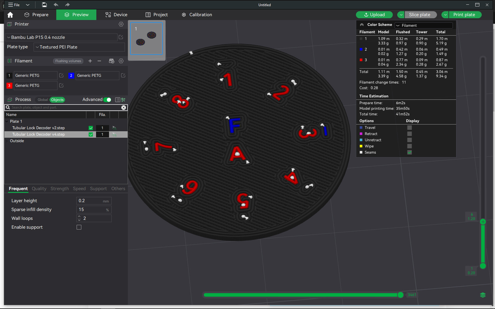
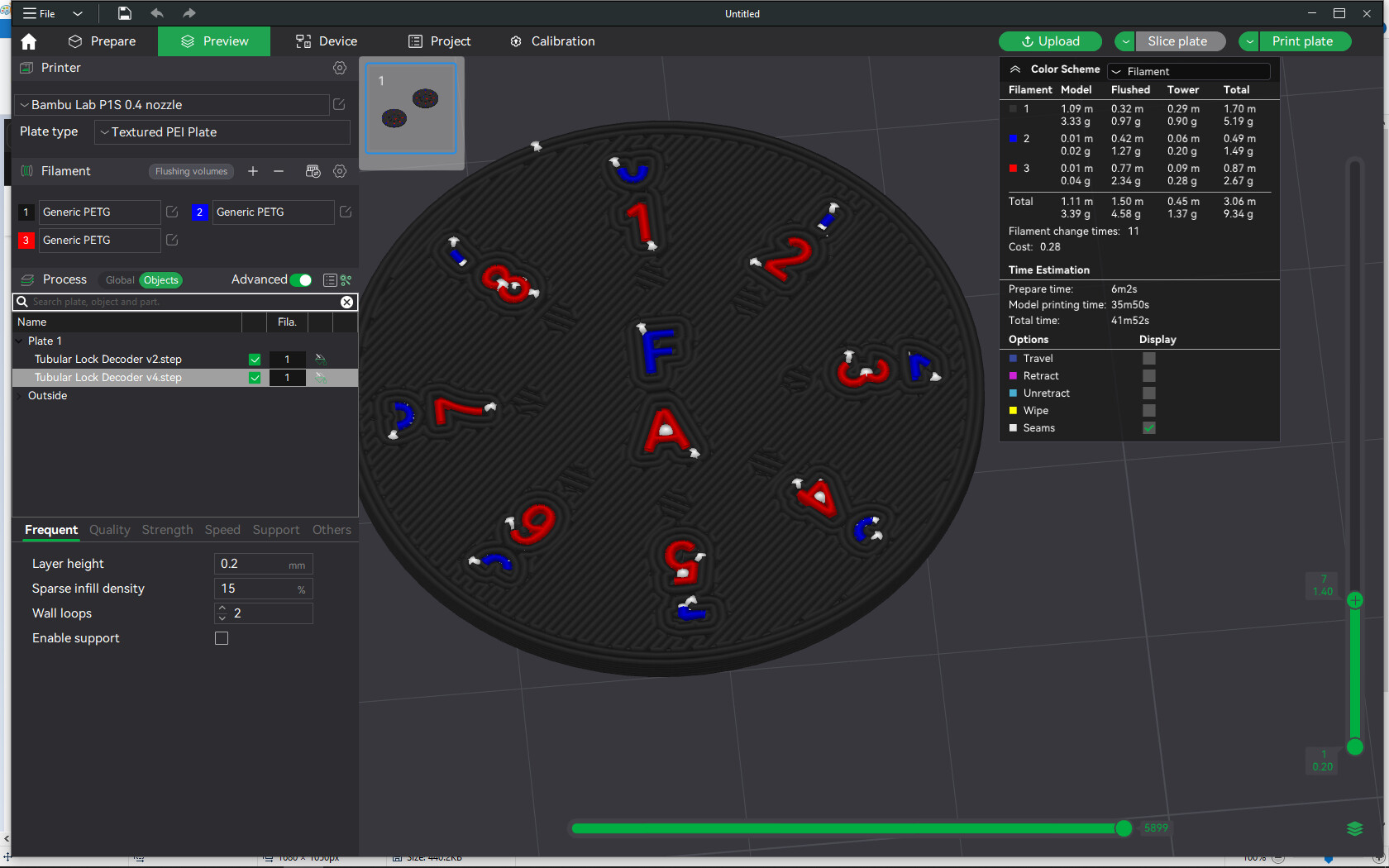
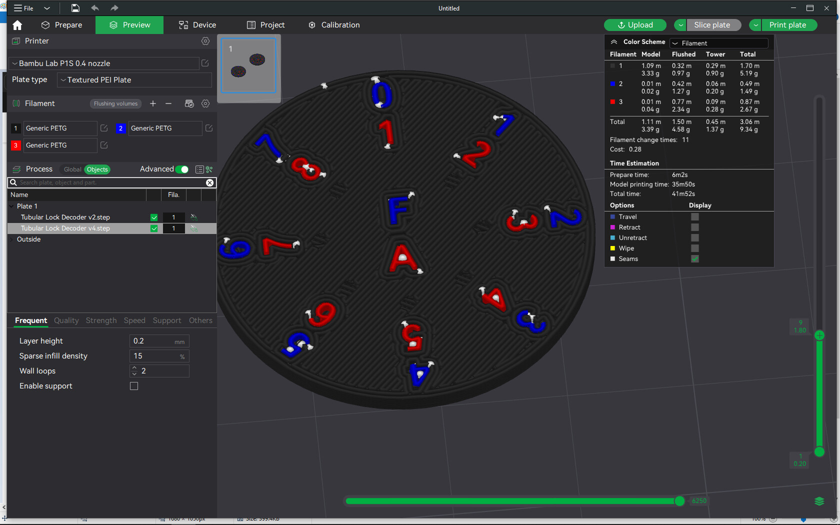
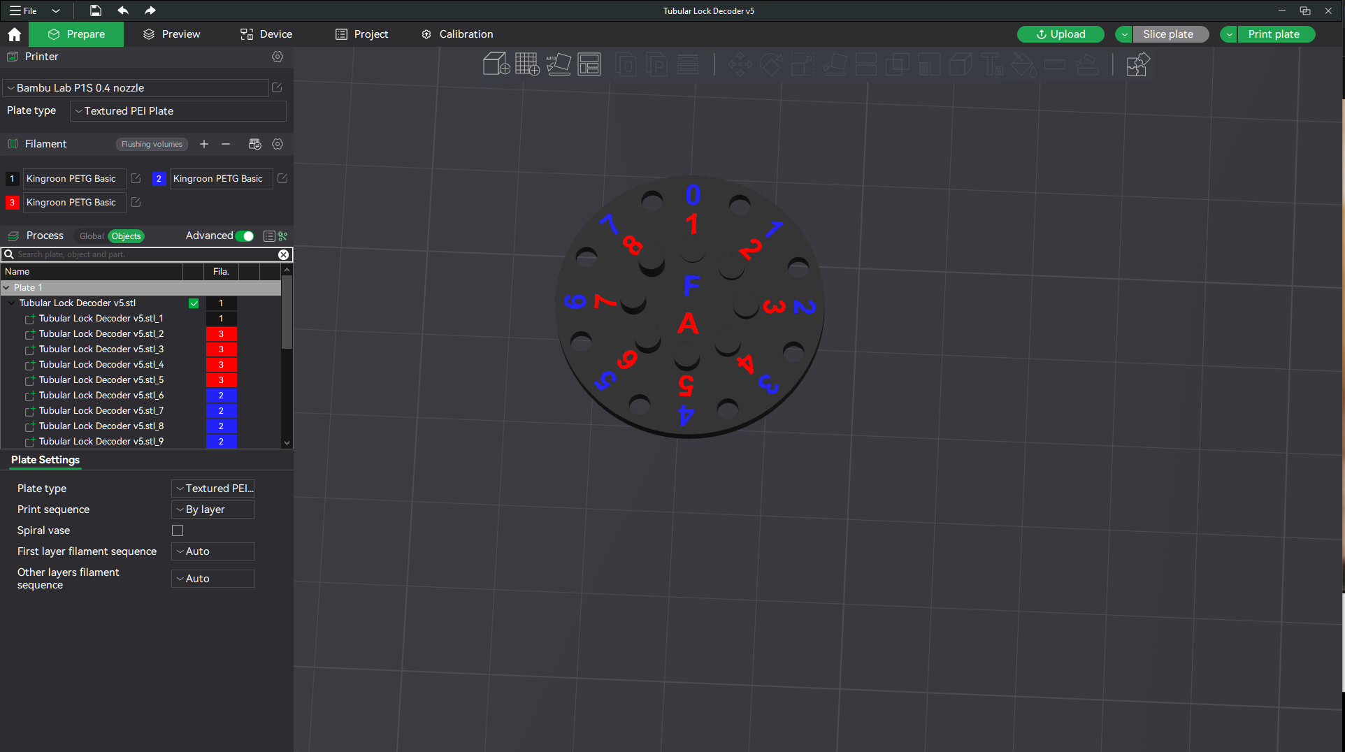
I sliced my part and instead of printing all color parts at the same layer, it kind of increases layer by layer until it fills up the whole number, this is very strange for me, or at least I hadn’t noticed it before. The lettering is all raised by .02mm to make it easier to pick out in the paint module of BS, but it seems it’s either doing some useless filament changes or the paint won’t have the same saturation throughout, being as how only the last (10th) layer has the complete paint.
Does anyone know how I could play with settings and make it work?
Here are a few images showing what I mean.
Without the actual model, this will be hard to figure out.
In case this is something easy.
Can you set the Wall Generator to Arachne and try again?
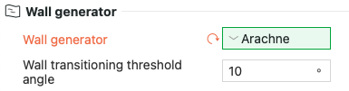
It is in fact set to arachne.
Here’s a link to the 3mf file and here’s the STEP file
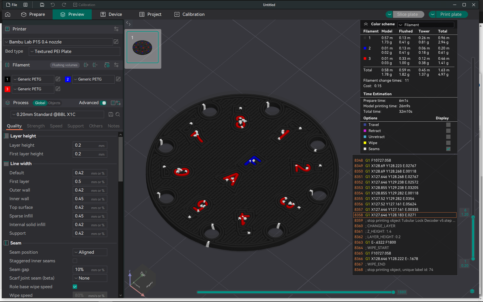
The 2 models on the plate are slightly different, one has 1mm extra diameter, I thought maybe it had to do with the perimeter walls, but no.
Weirdly yet not unexpectedly, the same happens with the latest OrcaSlicer.
I did ook at your step file, but, nothing jumped out as I do not have the skills in software that are capable of using them.
If you have STL files, I would happily look at those.
Have you tried this as STL imports? Just in case it is the STEP file, it is worth ruling out at this stage.
Didn’t think to check the STL, but I exported the file to SLT and the results are the same. So I’m thinking it must be something in the slicer.
You gave me the combined file as a single STL. Please provide the elements as separate files that are then grouped in the slicer.
It’s a single body, the text is only raised .01mm, meaning that if printed in a single color, it won’t show up, but it’s easy to select when painting.
That may well be your answer.
If you only have 0.1mm to paint, the slicer may not think it has sufficient importance to prioritise over the walls it sits next to.
You are printing at 0.2mm.
Try having the numbers at least 0.2mm above the base for testing and repeat.
The thing is both colors have the same characteristics, meaning they are both raised only .01mm, but the red ones are being rooted deeper and completely (since layer 5) than the blue ones.
I mean, there shouldn’t be a reason one behaves differently than the other in my opinion. Being as how both are constructed and painted in the same manner.
You may have missed this part.
If you do not wish to ‘waste’ the time testing, who am I to argue?
I truly appreciate the time you’ve dedicated to me, I’m not dismissing your suggestion, I just find it extremely odd how it behaves differently when both texts have the same characteristics. I don’t remember where I got the information to paint text this way. In any case, maybe you’re onto something and I need to have the letters as distinct bodies, I’ll test that out when I get home and report back.
Well, it’s solved now, I ended up splitting the model into its constituent parts and painting them individually by choosing the filament instead of the surfaces of the letters.
So this then.
Because of this.
That you had no interest in trying.
It is nice to see you pat yourself on the back for something you didn’t want to try and ignore the time taken by others to get you to the answer.
I am sure this will not hamper you from receiving help in the future.
I’m not dismissing what you suggested, It seems like you’re taking things too personally, I do appreciate your help, What you suggested
didn’t sound like something i knew how to do, I did end up creating separate objects in fusion, but they were exported in a single file, (STL or STEP) It’s inside Bambu Studio where the objects were split and painted individually.
Your suggestion to set layer height to .2mm would end up with embossed or debossed text which I didn’t want. The .01mm height difference of the letters with the rest of the surface makes me wonder since all the letters and numbers had the same height, yet only some were not sliced completely all the way through, making me question the point of the layer height as an answer.
I did do the testing, I don’t get why you feel like I disregarded your suggestions. I don’t get where from our interaction my replies convey a “Don’t waste my time” attitude, I even expressed my gratitude towards the time you spent helping out, I even acknowledged your suggestion to split the letters as bodies in the design.
Are you sour because I set my post as the solution? If you want me to set yours as the solution, I have no problem doing so, I do believe it pointed me in the right direction yet I took a different approach and my post itself shows what I did to get there.