Hi, so this whole time i been just printing some stuff out of makerworld and not really using the slicer for anything else than slicing. Now im trying to do some small things and i realize how incompetent i am at making little simple things. For example theres this model in makerworld which is a ptfe storage container. Im just trying to add some matching text around where theres text already but its never coming out the way i want it to. Im just trying to add basically the words “Pre-Cut” and “FOR AMS” on the side of the pre existing text but everytime i slice it it comes out like crap. I did color the letters in all dimensions using edge detection but cant get it to be nice.
Could i get a hand like for example which operation should i chose and which mode? Also i notice that im not able to color the letters when i chose something else than part…
Any help would be appreciated. Im trying to learn the slicer well before i start diving in more complex stuff like fusion. I wanna start making some more personalized stuff rather than always getting already made stuff.
Thank
Hi Max, 
What specifically isn’t the way you want it? Maybe an example of what “slices like crap” means?
One thing I can think of… do you want the text raised (protruding) from the surface like that? I can’t tell if the existing text is raised, but doesn’t seem like it. To embed the letters, try changing the “Embedded depth” to something a little thinner than the wall thickness, and “Thickness” to zero (or 0.1 which I think is the minimum).
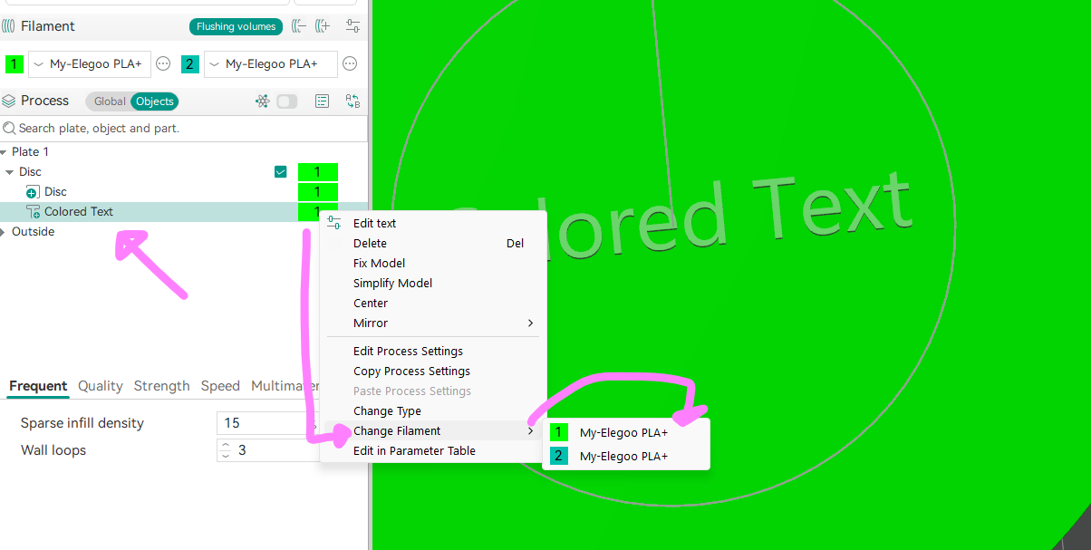
Since the letters you’re adding are going to be separate parts, you could just assign a filament color to the part(s) directly, instead of painting anything, which usually comes out better in the slice/print. I’m not sure how that will mix with the existing text if you have to paint that… probably fine. You could also see if the text in the original model can be separated by r-click on the model and Split → To Parts – if that menu option is grayed out then there are no separate parts in the original.
Not sure if you’ve tried printing this yet, but text/shapes on the sides like that can look a bit janky sometimes, especially with default slicer settings (at least on my H2C). I found slowing down the wall speeds and accelerations can help a lot. There’s also the setting Quality → Advanced → Smooth coefficient which I like to reduce to a fraction, like 0.5 – this smooths out speed changes. (May have to enabled “advanced” or even “develop” modes to see that, not sure.)
More opinion based: Use the slicer for slicing (there are lots of settings to explore already). Use Fusion, or other CAD/CAM for modeling. They have text tools and everything else you need, much more powerful than anything Studio offers or ever will. IMHO the modeling tools in Studio are a crutch, and often an unsteady one at that.
HTH,
-Max
2 Likes
Have you tried making the text a ‘modifier’? In the laft panel of the slicer, go to the ‘object’ tab and right-click the text item and change type to modifier.
For most text I find the slicer’s default 1.00 height to be poorly aesthetic, especially when oriented standing up. It creates real bad overhangs and loops on the bottom. Put that to between .2 and .4 and it’ll print out cleaner.
As for color, try using this strategy instead of paint: