From quick test shot to clean product photo — my small workflow breakdown
I wanted to share a small photography/editing breakdown of this shot, because I’ve been testing how far I can push a very simple setup into something that looks clean, intentional, and usable for product-style presentation.
This was not meant to be a “perfect studio masterpiece.”
The goal was much more practical:
-
build a repeatable workflow
-
keep the setup simple
-
get a result that still feels polished
-
show something others could realistically reproduce
That also fits well with the general advice in this thread: good model photos do not require an expensive or complicated studio, but they do benefit a lot from a clean background, a large soft light source, and controlled post-processing. The guide also emphasizes that soft, even light reduces harsh shadows and reflections, and that a simple white backdrop or lightbox can already go a long way.
1. The idea behind the shot
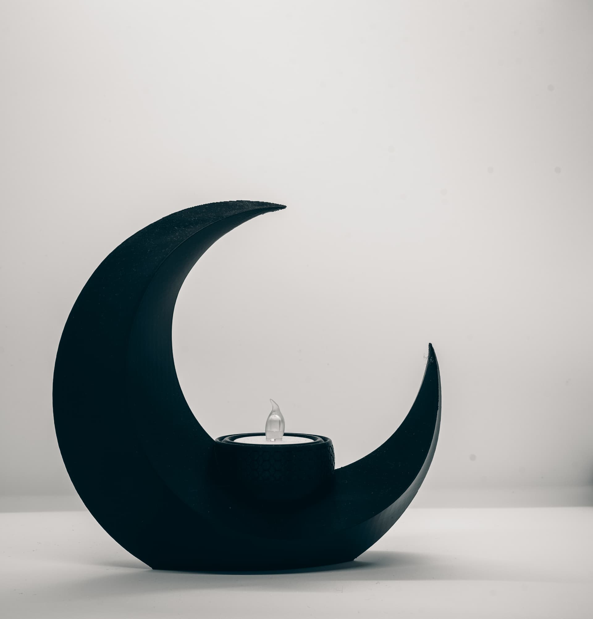
The subject is a dark crescent-shaped print with a small LED candle inside it.
Because the object itself is already very graphic and minimal, I did not want a busy composition or a decorative background. I wanted the image to feel:
-
calm
-
minimal
-
slightly moody
-
product-focused
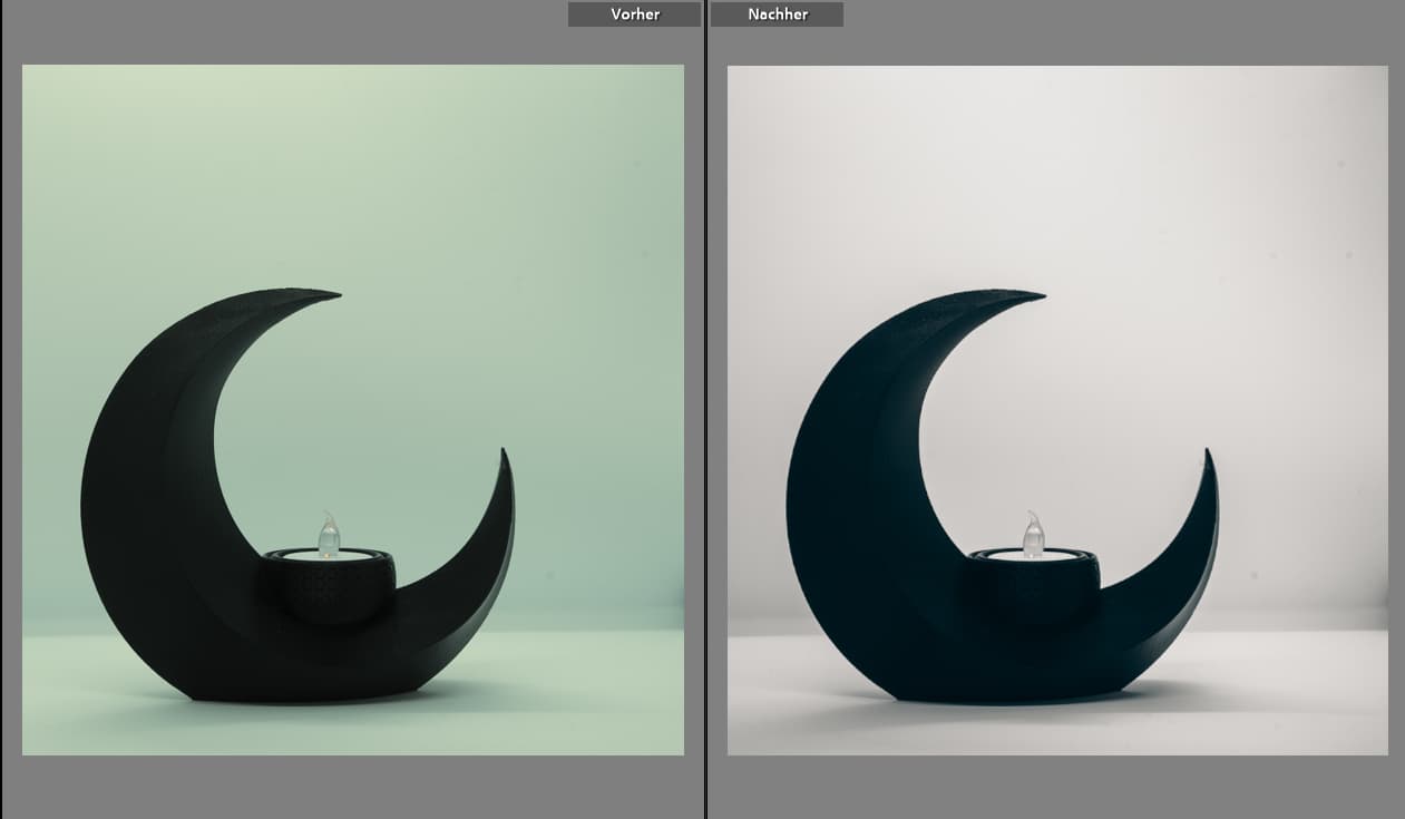
So instead of trying to create a “lifestyle” image, I leaned into a clean product-photo approach with a white background and a monochrome edit.
2. The setup
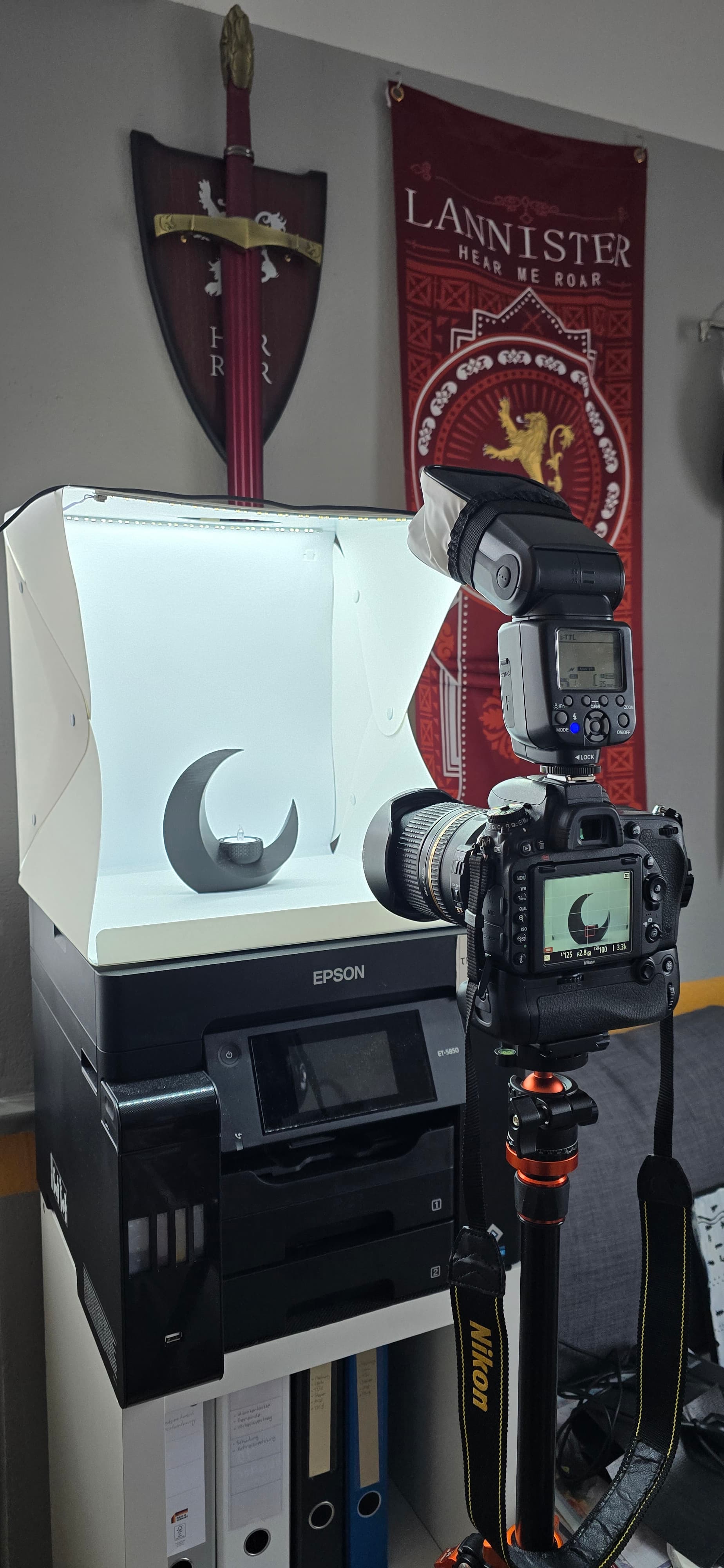
The setup was intentionally simple:
-
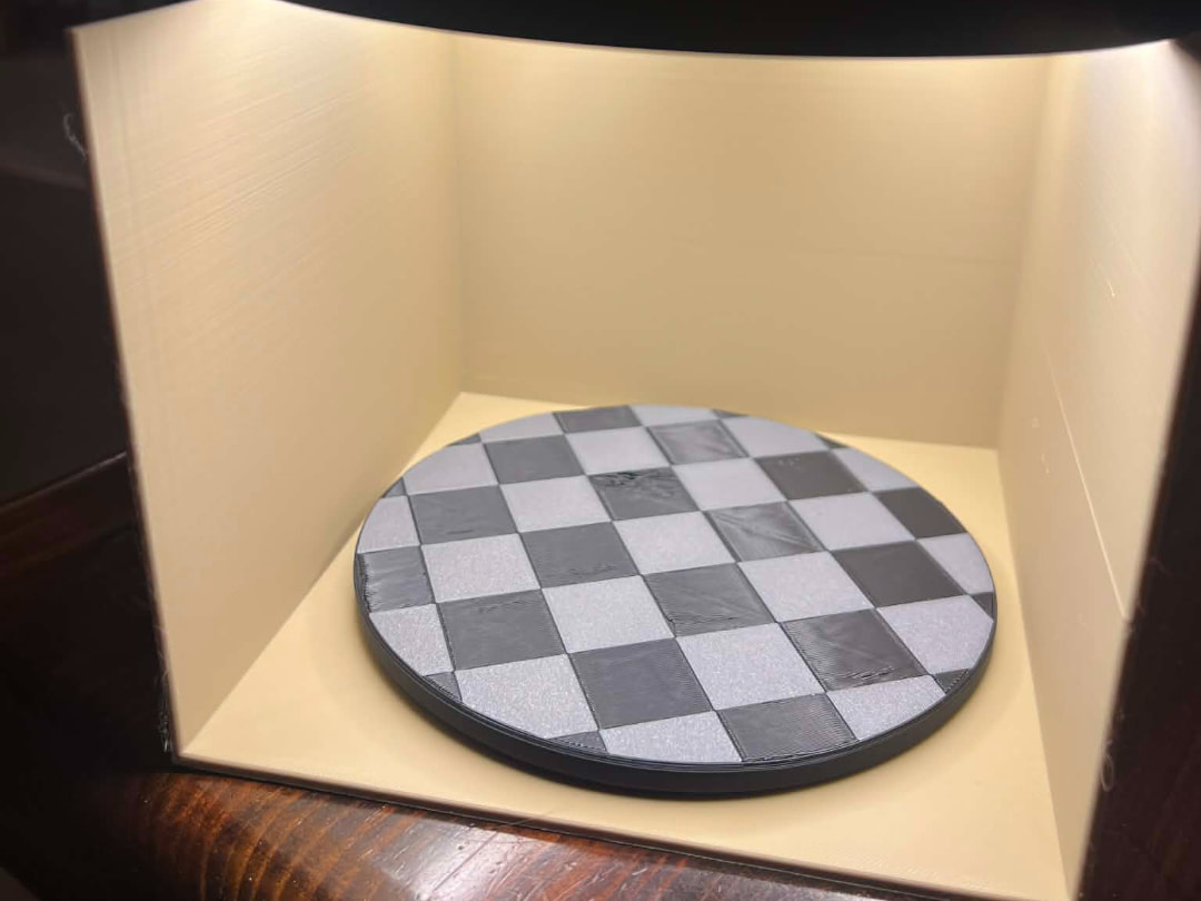
a small lightbox / white shooting area
-
one camera on tripod
-
one flash with diffuser / softbox
-
the object placed inside the lit box
-
no complicated props
This follows a lot of what is recommended in the MakerWorld photography guide: use a clean sweep/cyclorama-style background, keep distractions out, and rely on a large or softened light source to make the background more even and the shadows less harsh. The guide also mentions that even budget setups can work very well if the light is diffused properly, and that reflectors or white surfaces can help if the light source itself is limited.
The reason I liked this setup is that it gives me three important things immediately:
First: a neutral background with almost no distractions.
Second: soft enough light to avoid ugly, hard-edged shadows.
Third: consistency. I can put another model into the same setup later and get a similar visual language.
3. The camera side
I was using a dedicated camera instead of a phone for this test, but the general principle is exactly the same regardless of the device: avoid wide-angle distortion, keep the frame clean, and isolate the object well.
One of the strongest points from the guide is that a more telephoto field of view is usually better for this kind of work than a wide-angle shot. The thread repeatedly recommends avoiding very wide perspectives and instead using something closer to a 50mm equivalent or above, because it reduces distortion and makes the object look more natural and controlled.
That advice was very helpful here, because this kind of object loses a lot of elegance when photographed too wide. A wider lens makes the curves feel less calm and more distorted. A more neutral perspective keeps the crescent shape looking intentional.
4. Why I did not keep the original framing
My original framing was fine as a test shot, but not as strong as a final image.
At first, the object sat more centrally inside the full scene. Technically that worked, but visually it felt too neutral. It looked more like a documentation shot than an intentional composition.
So I started testing crops.
The key decision was this:
I did not want a perfect centered symmetry shot.
I wanted a composition with more tension and more negative space.
That is why I cropped the image so the crescent sits more clearly to the left, leaving more empty space to the right and above. This made the frame feel much more deliberate.
Why this crop works better
The improved crop does a few things at once:
-
It creates negative space on the right side.
-
It gives the image a stronger sense of direction.
-
It lets the eye travel from the large left curve, inward through the shape, and toward the candle.
-
It turns the object from “simply centered in the box” into “placed intentionally inside the frame.”
In other words: the crop changed the image from a setup photo into a photograph.
The guide also discusses visual control, avoiding distractions, and using composition and background treatment to keep the viewer’s eye on the subject. That is exactly what this crop was trying to achieve.
5. Why I did not crop even tighter
I tested tighter crops too, but I deliberately kept a good amount of breathing room around the object.
Why?
Because this object depends on silhouette and emptiness.
The open inner space of the crescent is part of the design. If I cropped too aggressively, the image would feel cramped and the elegant curve would lose some of its presence.
So the final crop was a balance between:
-
giving the object enough presence
-
keeping enough negative space
-
avoiding dead empty areas
-
preserving the minimalist mood
6. The raw file problem: technically okay, visually flat
The raw shot already had a good foundation:
-
clean white background
-
decent subject separation
-
controlled light
-
no major exposure disaster
But it still had a few issues that are very common with product shots of 3D prints:
The main problems were:
-
the background was not yet as clean and neutral as I wanted
-
the black print looked slightly flat
-
the candle drew a bit too much attention in places
-
the print’s layer structure could become ugly very fast if sharpened too aggressively
-
some small dust/sensor spots were visible in the background
So the edit was never about “saving” a bad image.
It was about refining a decent file into a controlled final look.
7. Why I chose black and white
I switched to a monochrome treatment very early.
That was a deliberate choice for three reasons:
1. The object itself is shape-driven
The crescent shape is already strong enough to carry the image without needing color.
2. Black and white simplifies the scene
It removes color distractions from the setup and makes the image feel more graphic.
3. It helps the image feel more cohesive
The white background, dark object, and small translucent candle become a very controlled tonal composition.
The guide also mentions using editing tools to adjust brightness, colors, and overall presentation while keeping the result readable and uncluttered. This monochrome conversion was exactly that kind of simplification.
8. Basic Lightroom treatment
My basic Lightroom settings were intentionally restrained.
I did not want the typical overprocessed look where every layer line screams at the viewer.
The general foundation was:
-
a small contrast reduction at the global level
-
slightly lifted shadows
-
controlled whites
-
slightly softened blacks compared with the more aggressive early version
-
moderate structure and clarity only
Why this matters
With 3D prints, it is very easy to over-edit.
If structure and clarity are pushed too high, the image starts to emphasize every layer line, every micro-reflection, and every tiny surface inconsistency. That can make the print look harsher and cheaper than it does in reality.
So instead of using editing to “show maximum detail,” I used it to show:
-
shape
-
tonal depth
-
clean separation
-
believable texture
That was a major change in the workflow.
Earlier versions were much more aggressive and looked more digital and harsh. Pulling back on that was one of the most important improvements.
9. The tone curve
The tone curve was also kept relatively subtle.
Instead of a dramatic S-curve, I used a gentler curve to:
-
lift the brighter areas slightly
-
keep the background feeling airy
-
preserve enough depth in the object
-
avoid crushing the shadows too hard
That matters because this image depends on smooth tonal transitions. A strong, punchy contrast curve would have made it look more dramatic, but also less elegant.
10. The most important part: masks
The masks were the real turning point.
This is where the image stopped being “a decent black and white edit” and started to become a proper product-style image.
Mask 1 — subject mask
I selected the object itself and applied:
-
Structure: -20
-
Clarity: -10
This may sound counterintuitive at first, but it was absolutely intentional.
Why I reduced structure and clarity on the object
Because 3D prints are full of repeating micro-texture:
-
layer lines
-
tiny surface reflections
-
print artifacts that are not actually important to the design
If those are emphasized too much, the object becomes visually noisy.
Reducing structure and clarity a little on the subject does not erase the print.
It simply stops Lightroom from over-describing the surface.
The result is:
-
a smoother, more premium-looking object
-
better emphasis on silhouette instead of surface noise
-
a more “photographed product” feeling rather than a “heavily sharpened print test”
This was probably the single most important mask in the entire edit.
Mask 2 — background / surrounding area
For the surrounding area, I used a separate mask and lightly adjusted it so the background stayed clean and readable.
The background treatment was intentionally subtle. I only wanted it to feel slightly more open and slightly more separated from the subject, not obviously manipulated.
That means very small adjustments only, such as:
-
a tiny brightness lift
-
a small clarity increase in the background zone if needed
-
keeping the background neutral and even
Why this works
This creates a quiet contrast:
-
the object becomes slightly smoother
-
the surrounding space stays clean and clear
-
the image gains separation without looking fake
So instead of adding “pop” with heavy global contrast, the separation is created by different treatment of subject and background.
That is a much more controlled way to edit product photos.
11. Why I did not heavily brighten the candle
The candle is visually important, but I did not want it to become the brightest hero element.
The purpose of the candle is to complete the shape and provide a small focal point inside the crescent.
It should support the composition, not dominate it.
So I kept it restrained.
If the flame gets too bright, the eye jumps there immediately and stays there.
If it stays soft, the eye first reads the crescent shape, then moves inward naturally.
That gives the image a much calmer flow.
12. Spot cleanup and finishing work
One unglamorous but very important step was cleanup.
The light background made small imperfections visible:
-
dust
-
sensor spots
-
tiny marks in empty areas
Those absolutely have to go in a final product-style image.
This is one of those things that seems minor, but it makes a huge difference.
A clean background tells the viewer that the image was finished with care.
13. Why the final image works better than the earlier versions
The final image works better because all parts now support the same goal.
The setup supports simplicity.
The crop supports tension and negative space.
The black and white conversion supports minimalism.
The masks support surface control.
The cleanup supports polish.
Nothing is extreme.
Everything is doing a small job in the same direction.
That is why the final image feels stronger than the earlier edits, even though the changes are not dramatic individually.
14. What I would repeat for future shots
This test was useful because it gave me a workflow I can actually reuse.
For future model photography, I would keep the same general recipe:
Capture
-
simple clean lightbox / white environment
-
softened flash or soft light
-
stable tripod setup
-
avoid wide-angle distortion
-
keep the background distraction-free
Composition
-
decide early if the image should be centered or asymmetrical
-
use negative space deliberately
-
crop for visual weight, not just technical symmetry
Editing
-
do not overuse structure/clarity on 3D prints
-
convert to monochrome only if the design benefits from it
-
use subject masks to smooth visual noise slightly
-
use background masks for separation, not for fake drama
-
remove dust and spots before calling it done
15. Final thought
What I liked most about this process is that it proves something simple:
You do not need a giant commercial studio to create a clean product-style image.
A basic setup, thoughtful crop, restrained edit, and a couple of smart masks are already enough to turn a quick test shot into something much more intentional.
And for me, that is the real value of this workflow:
not perfection, but repeatability.
 Additional resources
For anyone who wants to dive a bit deeper or try to replicate the exact workflow, I’ve included a ZIP file with all relevant Lightroom documentation and settings.
The file is named:
lightroom-setup_2026-03-29-114423
you can found this here:
https://thores-pieksekisten.de/files/lightroom-setup_2026-03-29-114423.zip
Inside the ZIP you’ll find:
 visual screenshots of the full Lightroom workflow
 all adjustment panels as shown in this post
 mask setups (subject + background) documented step by step
 the actual .xmp preset file, containing all applied Lightroom values
This way you can either:
follow the process manually step by step
or directly import the preset and use it as a starting point for your own shots
The idea behind this is not to provide a “one-click solution,” but to make the process transparent and reproducible.
 Final note
If you have any questions about the setup, the shooting process, or the Lightroom workflow, feel free to ask — I’m happy to help.
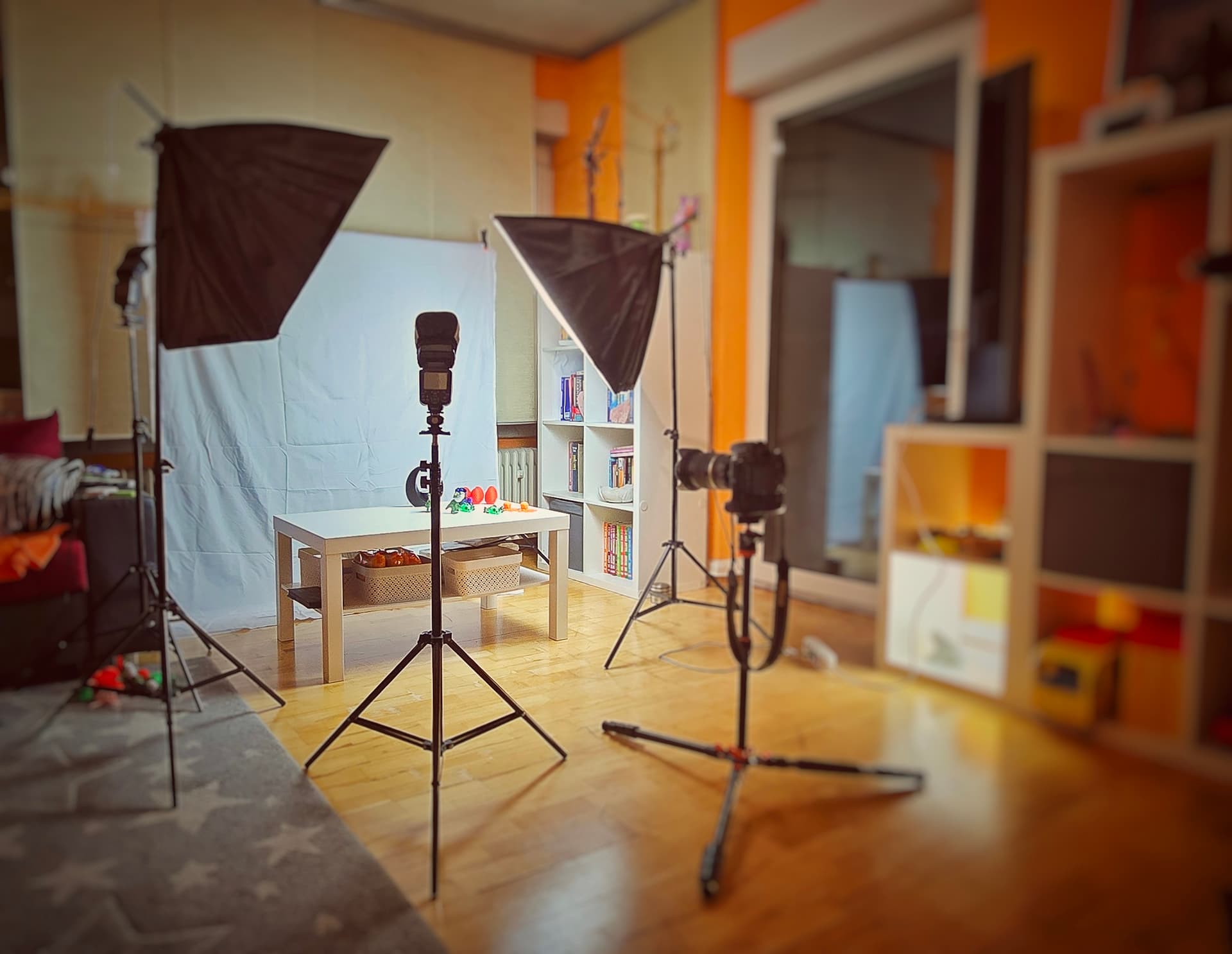
If there’s interest from the community, I can also do a similar breakdown using my larger studio setup with bigger models, more advanced lighting, and a slightly different approach.
I think it could be interesting to compare:
-
simple / compact setup (this post)
vs. -
full studio workflow (larger scale)
So if that would be useful, just let me know 
 Camera & lens (for reference)
For this shot I used:
- Nikon D700 (full-frame)
- Tamron SP 24–70mm f/2.8 Di USD
That said, the setup and workflow shown here can absolutely be replicated with other cameras or even a smartphone — lighting and composition were the key factors.