Intro
Before getting into this, I want to give proper credit to the creator of the “Ultimate MakerWorld Photography Guide,” @Zammer3D
That guide already covers a lot of the fundamentals really well and honestly influenced how I approach my own shots.
If you haven’t seen it yet, it’s definitely worth checking out:
 Ultimate MakerWorld Photography Guide
This post builds directly on that. A lot of the basics are already explained there — clean backgrounds, soft lighting, simple setups, better phone camera usage, and why post-processing matters.
Instead of repeating all of that, I wanted to focus on one part that often stays a bit unclear: the actual editing process.
So this is more of a practical follow-up. The idea is simple — take a decent photo and turn it into a cleaner, more intentional final image with a workflow that people can realistically follow. No big studio, no one-click tricks — just a structured step-by-step breakdown in Snapseed and Lightroom.
If you’re completely new to this, I’d recommend starting with the original guide first. It already explains the fundamentals around setup, lighting, and shooting. This post just continues from there and focuses on editing.
Before You Start
Note:
For MakerWorld, a 4:3 ratio is often a solid and safe default, as it fits well with how images are displayed on the platform.
In this post, I intentionally didn’t focus on that part, since the goal here is purely the editing workflow — not how the image is captured or composed.
The base image already assumes a clean setup, including enough space for cropping if needed.
If you’re starting from scratch, it can be helpful to shoot slightly wider to give yourself more flexibility later when refining the final frame.
All examples use the same base image so you can clearly see the differences between each step.
Additional Resources
This section will grow over time with additional tips, tools, and community contributions.
Snapseed
Add layer masks
Lightroom Guide
This is the Lightroom workflow I personally use to refine the image step by step.
Image Analysis
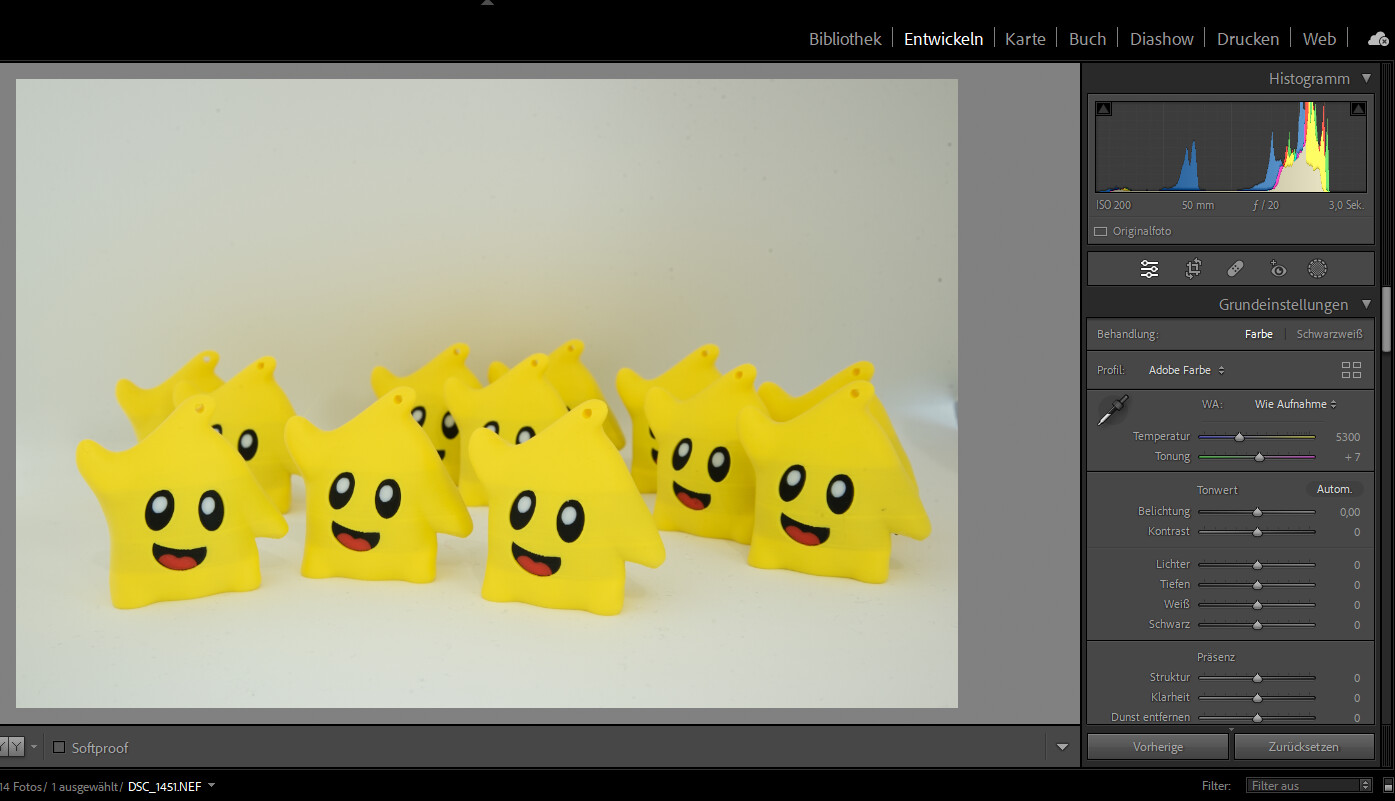
At first glance, the image looks naturally taken, but it does not yet have a clearly guided visual focus.
The light is there, but it is not yet fully controlled. Because of that, the subject does not clearly separate from the background.
The exposure is generally solid, but some areas still feel a bit flat.
The contrast has not yet been worked out properly, which makes the image feel less deep.
The colors are basically fine, but they still feel slightly unstructured and not intentionally controlled.
As a result, the viewer’s eye is not automatically guided toward the subject.
The subject is clearly visible, but it does not stand out strongly enough from the rest of the image.
The background currently contains too much visual information and competes with the subject.
What we will improve
- Increase contrast to create depth
- Guide the light toward the subject
- Control bright areas
- Structure and calm the colors
- Separate subject and background
Important:
Nothing is changed in this step.
Crop – Improve the Framing
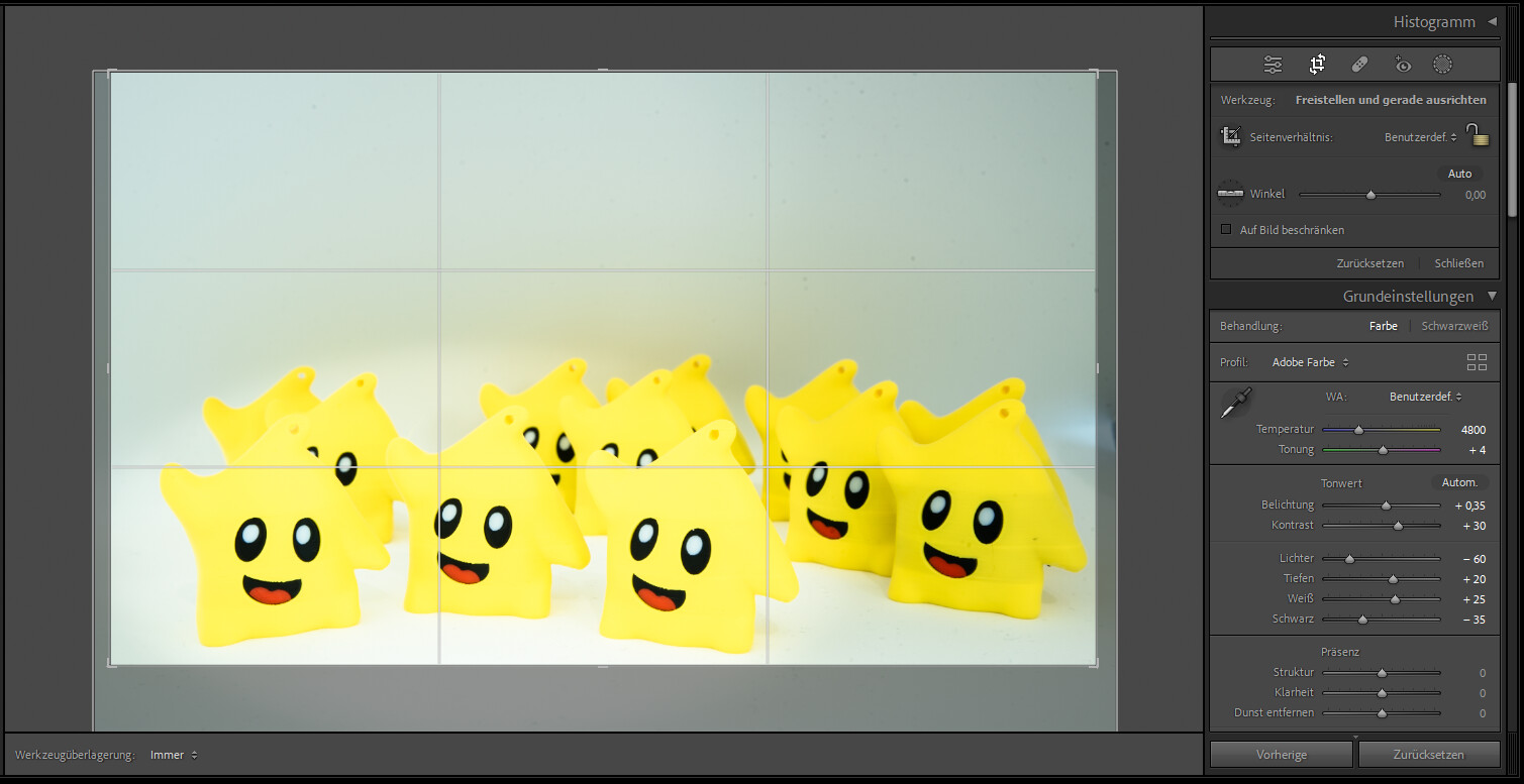
Open the crop tool:
- Press R or click the crop tool
Adjust the frame:
- Bottom: reduce to ~5–10% margin
- Top: keep unchanged
- Left / Right: unchanged
Use the grid:
- Subject sits on the lower third line
- Upper space stays larger
Result
- less empty space
- clearer focus
- more compact composition
Important:
Do not remove the bottom margin completely.
Basic Correction – Exposure & Contrast
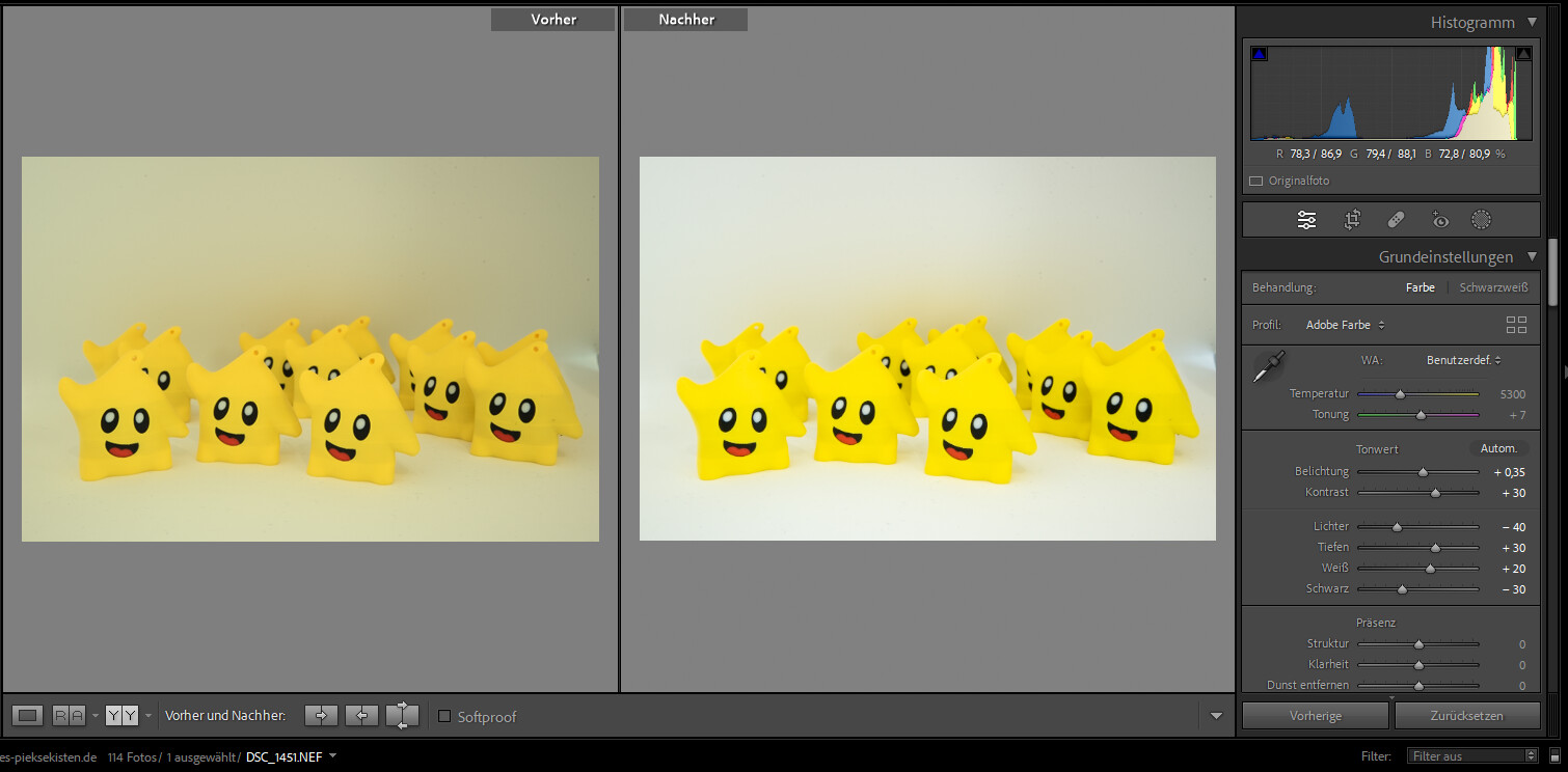
Settings:
- Exposure: +0.35
- Contrast: +30
- Highlights: -45
- Shadows: +30
- Whites: +20
- Blacks: -30
What happens
- image becomes brighter and clearer
- highlights controlled
- shadows reveal detail
- blacks add depth
Watch out:
Do not overexpose the yellow subject.
White Balance
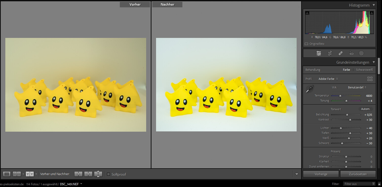
Settings:
- Temperature: 5300 → 4800
- Tint: +7 → +4
What happens
- removes warm color cast
- background becomes neutral
- yellow stays clean
Watch out:
Do not push colors toward green.
Highlights & Shadows – Refinement
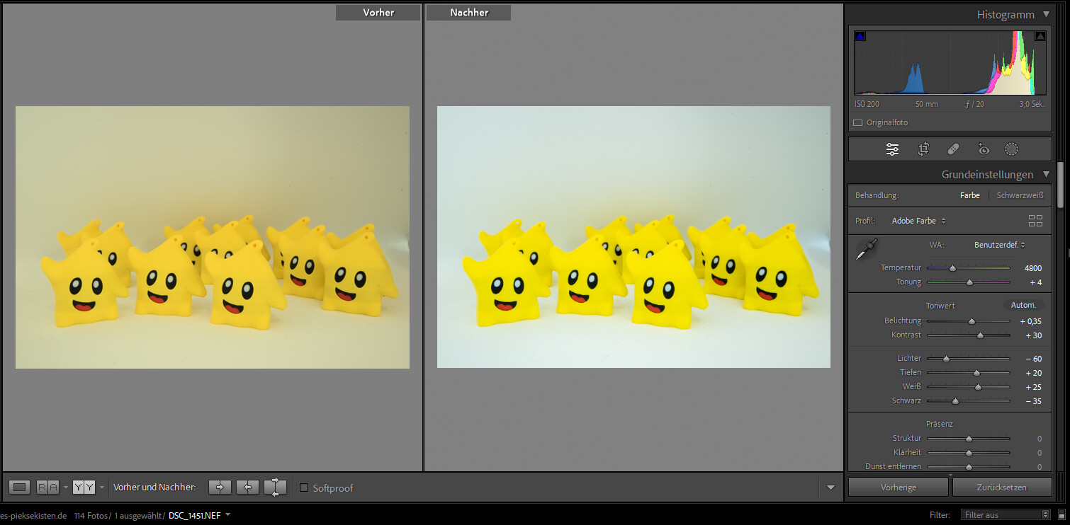
Adjust:
- Highlights: -60
- Shadows: +20
- Whites: +25
- Blacks: -35
Result
- more depth
- calmer background
- better light structure
Typical mistake:
Too much = flat or crushed image
Color Control (HSL)
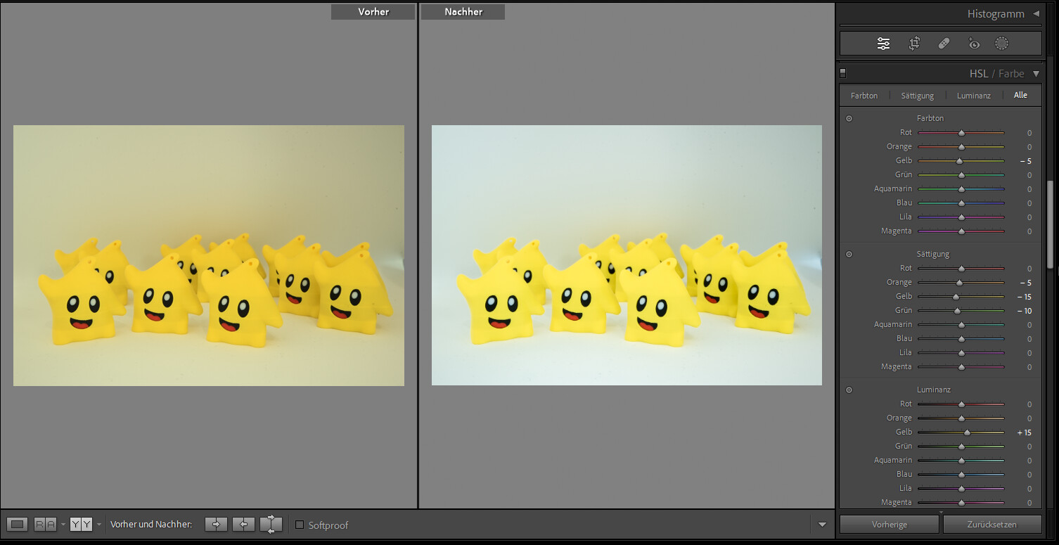
Yellow:
- Hue: -5
- Saturation: -15
- Luminance: +15
Orange:
- Saturation: -5
Green:
- Saturation: -10
Result
- cleaner yellow
- less color noise
- calmer background
Emphasize Subject (Radial Mask)
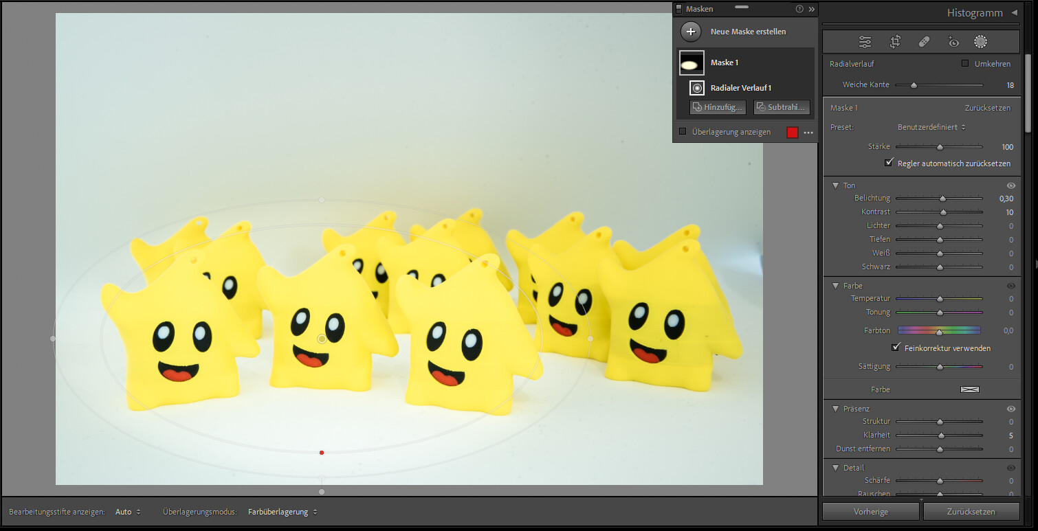
Mask:
- place over front figures
- feather: 80–100
Settings:
- Exposure: +0.30
- Contrast: +10
- Clarity: +5
Result
- subject stands out
- soft transition
Background Control (Inverted Mask)
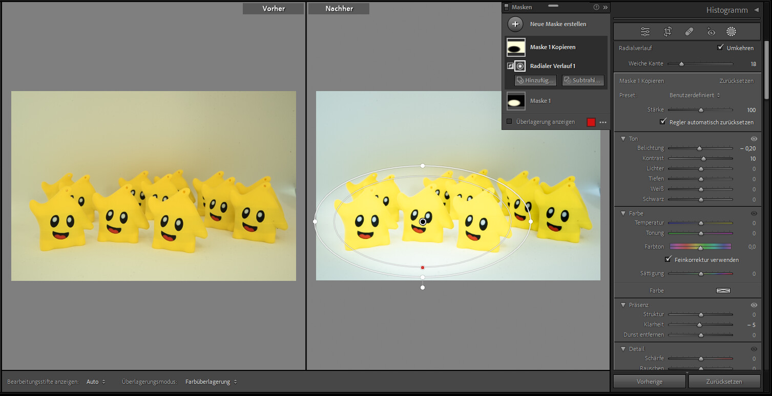
Duplicate mask → Invert
Settings:
- Exposure: -0.20
- Clarity: -5
Result
- darker, softer background
- stronger separation
Tone Curve
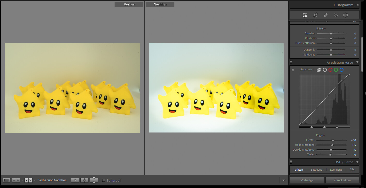
Settings:
- Highlights: +10
- Lights: +5
- Darks: -5
- Shadows: -10
Result
- refined contrast
- natural depth
Sharpening
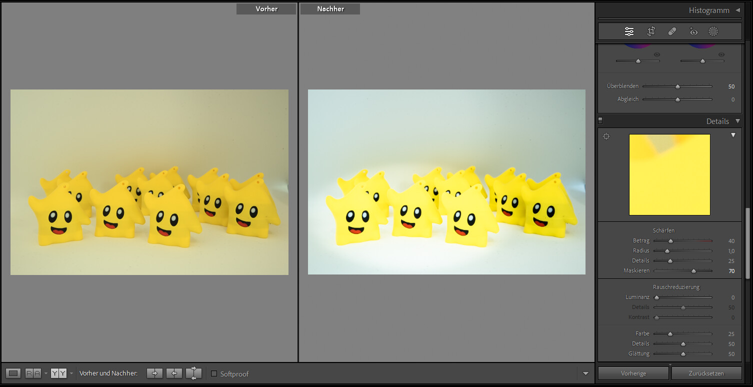
Settings:
- Amount: 40
- Radius: 1.0
- Detail: 25
- Masking: 70–80 (ALT key)
Result
- sharp subject
- soft background
Vignette
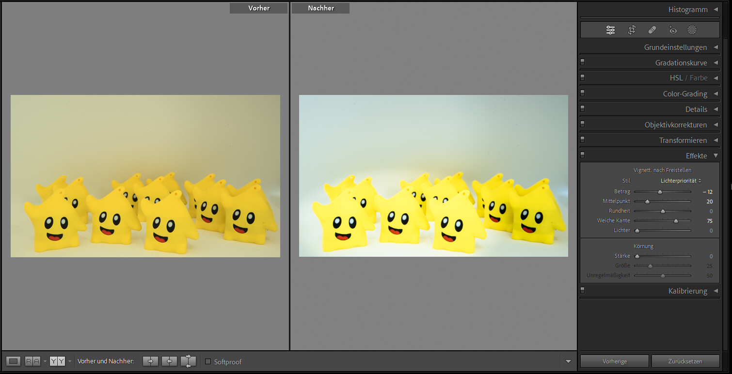
Settings:
- Amount: -12
- Midpoint: +20
- Roundness: 0
- Feather: 75
Result
- focus on subject
- softer edges
Final Result
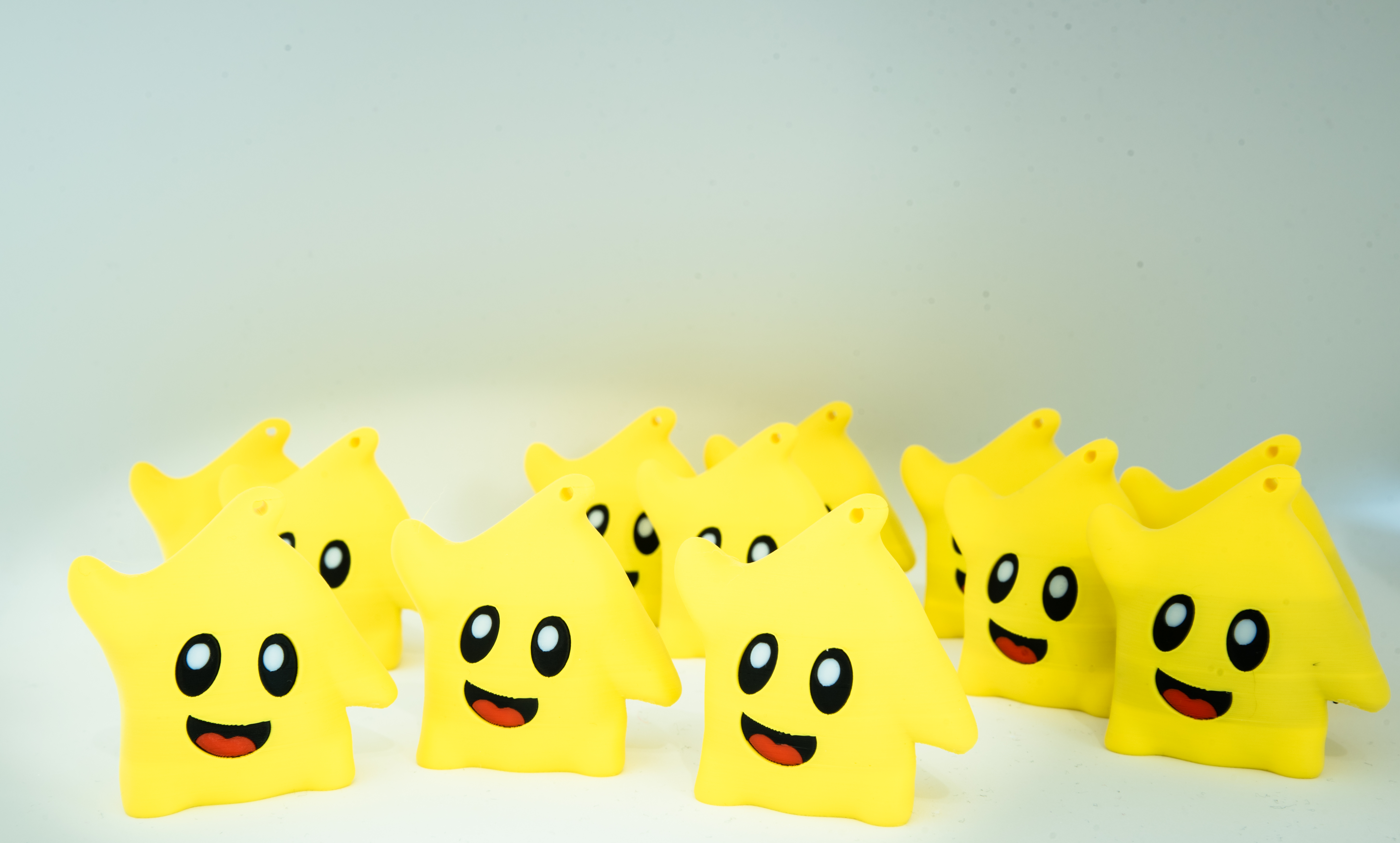
This is your final image.
The subject is now clearly separated, the light is controlled, and the overall image feels clean, structured, and natural.
Snapseed Guide
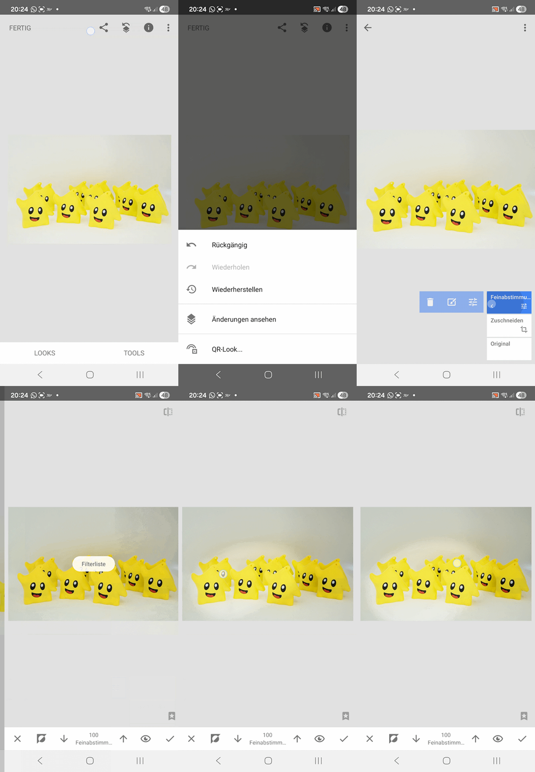
If you prefer editing directly on your phone, this is the same workflow recreated in Snapseed.
Image Analysis and Editing Goal
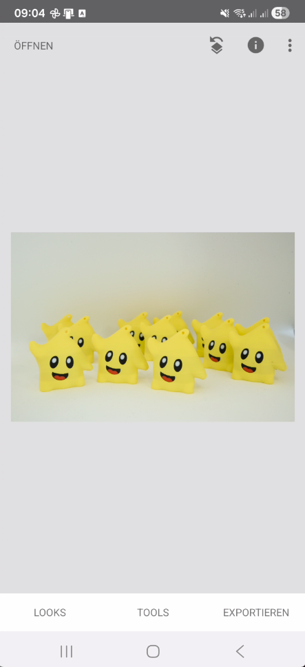
The original image shows several yellow figures placed on a bright, slightly textured background.
Overall, the image appears slightly warm and low in contrast, which prevents the subject from standing out clearly.
The goal of this edit is to make the image look cleaner, more structured, and more contrast-rich, without making it look unnatural.
The front figures should be visually emphasized, while the background becomes calmer and less dominant.
Important:
The edit should remain realistic and must not look artificial or overprocessed.
Crop the Image

In the first step, the image is cropped to guide the focus more clearly toward the subject.
The upper area is reduced because it mostly consists of empty background and does not add value to the image.
Additionally, the sides are slightly adjusted so the front figures move more into the center.
The crop helps the image feel calmer and directs attention clearly to the main subject.
The composition intentionally remains natural and not perfectly symmetrical.
Important:
No figure must be cut off. Cropping is only used to improve composition, not to change the subject.
RAW Development (Base Exposure)
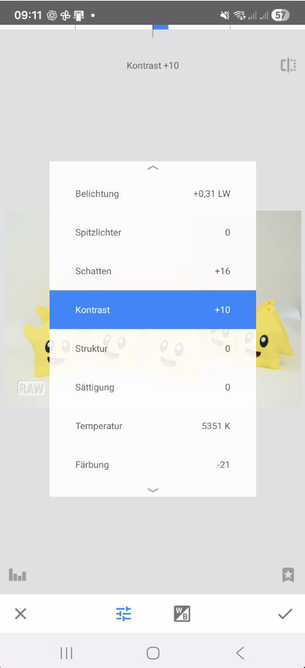
Since the image is processed as a RAW file, the first adjustment is done in Snapseed’s RAW development.
This step sets the exposure as the technical foundation for everything that follows.
The image is slightly brightened while making sure that bright areas do not get overexposed.
At the same time, shadows are lifted to reveal details in darker areas.
This step only creates a clean base — the actual visual look will come later.
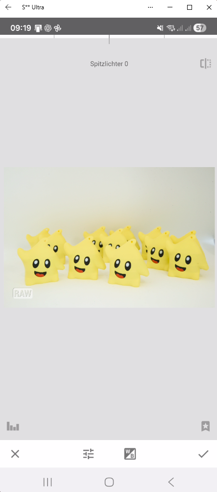
Snapseed Settings (RAW Develop)
Apply the values exactly:
- Exposure: +0.31
- Highlights: 0
- Shadows: +16
- Contrast: +10
- Structure: 0
- Saturation: 0
- Temperature: 5351 K
- Tint: -21
Adjust White Balance
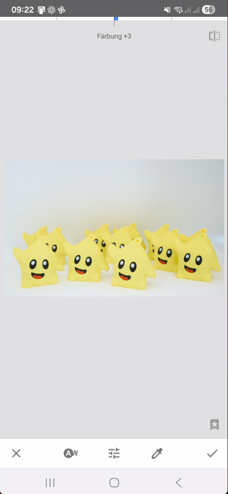
After the technical base is set, the white balance is adjusted.
This step is crucial because it defines the overall color look of the image.
The original image appears slightly warm and yellowish.
The goal is to make it look more neutral and clean without losing its friendly tone.
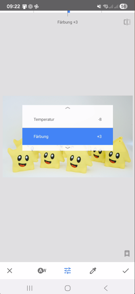
Snapseed Instructions
Open:
Tools → White Balance
Set the values:
- Temperature: slightly left (-5 to -10)
- Tint: slightly right (+2 to +5)
Important:
Do not make the image too cool.
Adjust Colors Carefully
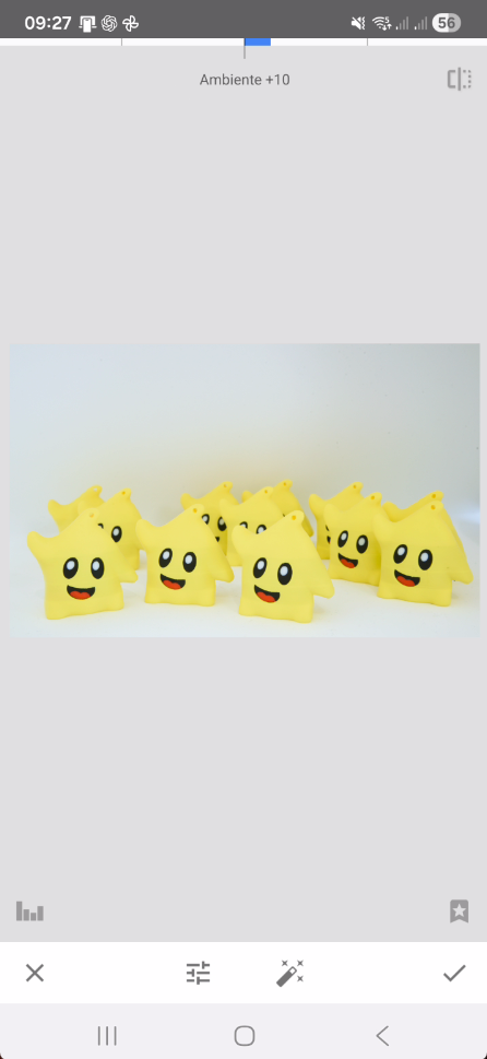
In this step, the colors are slightly optimized.
The goal is to make the yellow figures look cleaner and more defined without losing naturalness.
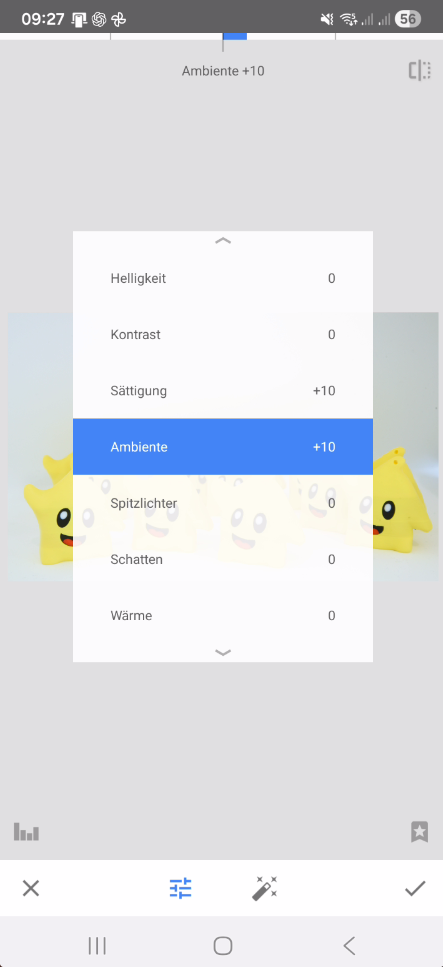
Settings:
- Saturation: +10
- Ambience: +10
Important:
Too much saturation quickly looks unnatural.
Emphasize the Subject (Selective Tool)
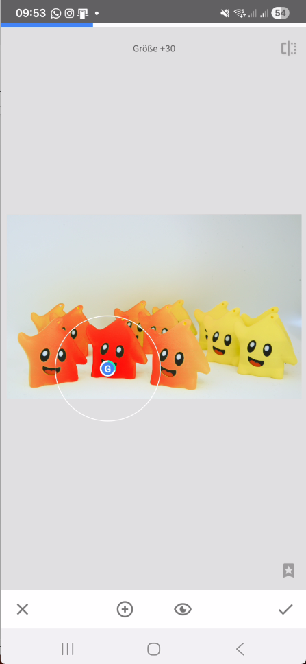
In this step, the main subject is deliberately emphasized using the Selective Tool.
Settings:
- Brightness: +10
- Contrast: +5
- Structure: +5
- Saturation: +5
Important:
The effect should remain soft and natural.
Calm the Background
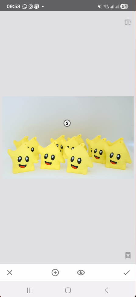
After emphasizing the subject, the background is reduced.
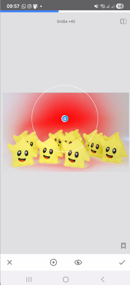
Settings:
- Brightness: -15
- Contrast: -5
- Structure: -10
- Saturation: -5
Important:
The background should only be reduced slightly.
Finalize the Overall Look
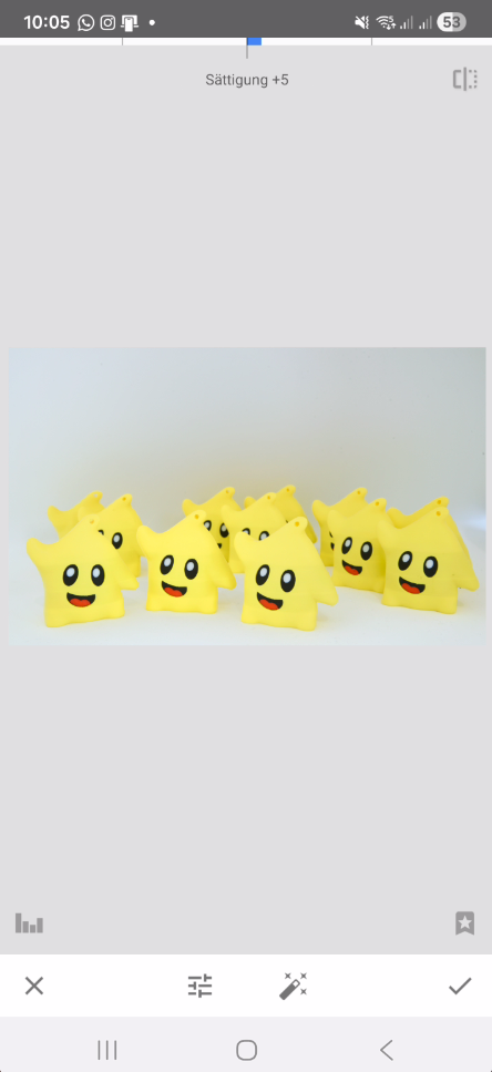
In this step, the overall image effect is refined.
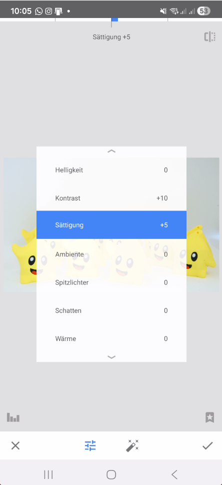
Settings:
- Contrast: +10
- Saturation: +5
Enhance Details
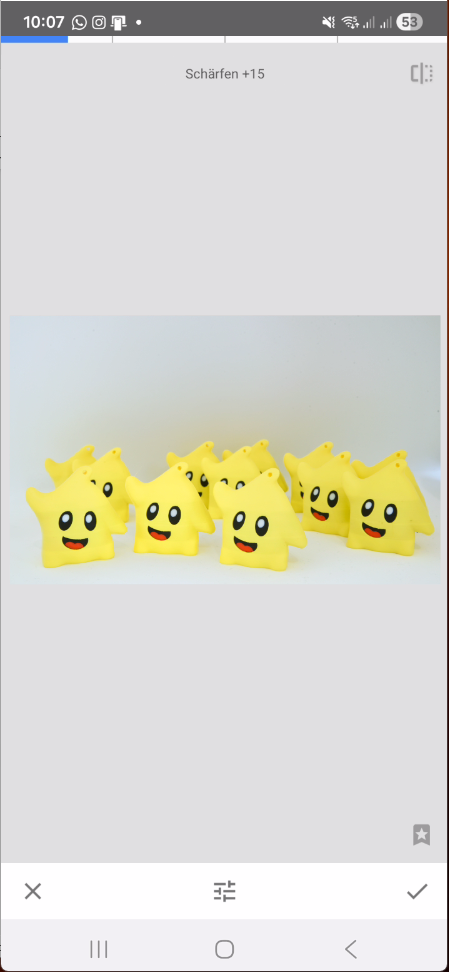
In the final technical step, fine details are enhanced.
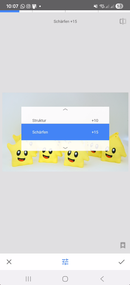
Settings:
- Structure: +10
- Sharpening: +10 to +20
Important:
Avoid over-sharpening.
Optional: Add a Subtle Vignette
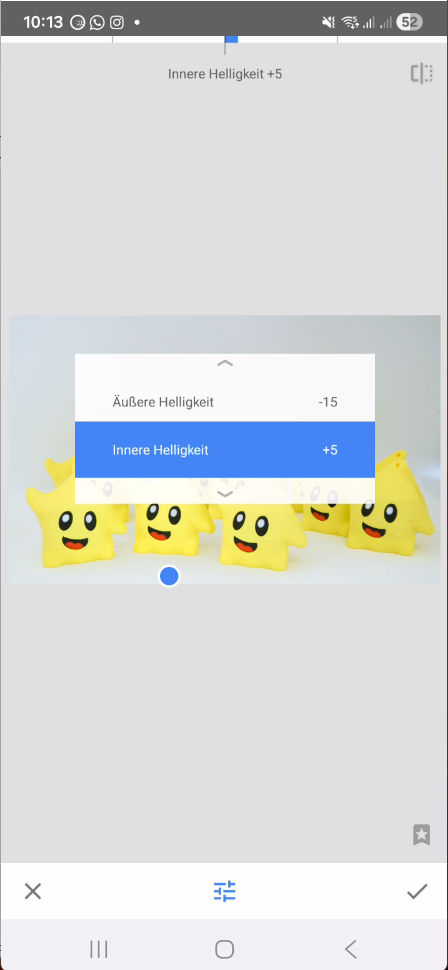
In the final step, a subtle vignette can enhance the image.
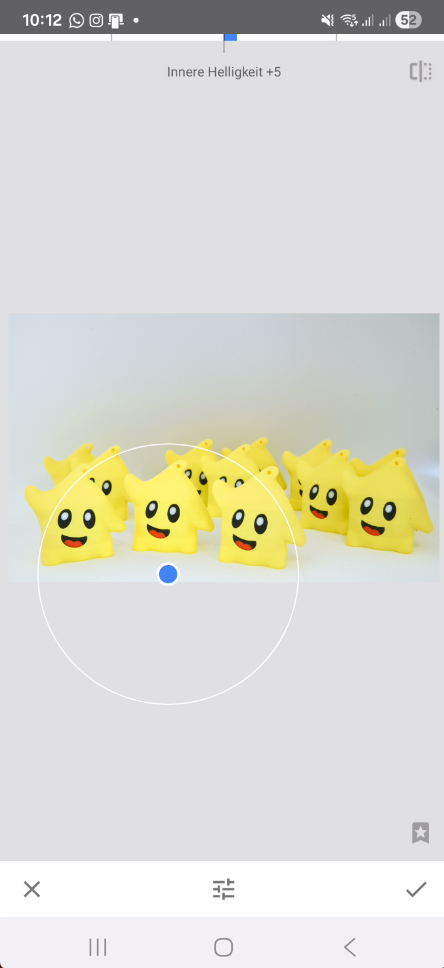
Settings:
- Outer Brightness: -10 to -20
- Inner Brightness: 0 to +5
Important:
If you clearly see the vignette → it is too strong.
Final Result
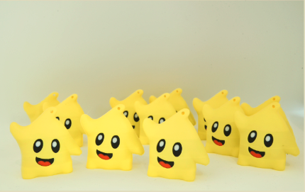
This is your final image — clean, balanced, and clearly focused on the subject..
Final Thoughts
Both workflows follow the same idea: clean up the image, guide the light, and make the subject stand out naturally.
Lightroom gives you more control, especially with masks, while Snapseed is a great option if you want to edit directly on your phone.
At the end, it’s not about the tool — it’s about understanding what the image needs.
Feel free to test both approaches and adjust them to your own style.
AI-Assisted Editing (Lightroom, Photoshop & Snapseed)
One important aspect that should be mentioned when working with modern editing tools like Lightroom or Photoshop is how much of the workflow is now supported by AI-based features.
In many cases, selections that used to require manual masking can now be created automatically. Subjects, backgrounds, and even specific areas of an image can be detected and adjusted independently.
This makes it much easier to refine an image without affecting the main subject.
For example, the background can be darkened or desaturated while the subject remains untouched — as long as the tonal range and color separation are clean enough.
This is especially noticeable in tools like Lightroom masks or Photoshop selections, where the software can separate elements based on contrast, depth, and color.
A similar concept can also be seen in mobile workflows.
Apps like Snapseed, developed by Google, use advanced image processing and machine learning techniques in the background. On newer Android devices, additional system-level features may also support image processing and optimization.
Depending on the device, additional AI-assisted enhancements may support the editing process in the background. — even if they are not directly visible as a specific feature inside Snapseed itself.
However, these tools are not a replacement for a solid base image.
If highlights are blown out, details are lost, or colors are heavily distorted, even AI-assisted selections will struggle to produce clean results.
That’s why the steps shown in this guide — exposure, contrast, color balance — are still the most important foundation.
AI helps to speed up and simplify the process, but it only works properly if the image itself is technically sound.
Understanding what the image needs will always be more important than relying on automated tools.
 — thanks for bringing that up.
 I’m always happy to see useful guides like this! sorry my reply wasn’t very clear- I didn’t have that section in there before, I’ve just edited it in today